*except one.
When it comes to clothes and fashion, I admit, I’m a bit of a contrarian. Those of you who know me may have (you have) seen me rock a fringe jacket and bolo tie. I wear pieces of clothing that other people think are stupid but I think are awesome.
Beauty’s in the eye of the beholder, isn’t it?
The NHL is celebrating its centennial in 2017. There’s been a lot of teams, and those teams have worn a lot of different jerseys. It’s impossible to hit the top shelf with every design. There’s bound to be jerseys throughout the years that people use rich adjectives like “hideous,” “appalling”, “disgusting,” and “revolting” to describe. Like my wardrobe, the NHL has had a lot of those.
Here’s the clothing contrarian coming out in me again: I kind of dig the “ugly” jerseys. They’re usually more colourful, regional, bizarre, daring, era-reflective, and memorable than the jerseys that have stood the test of time.
I know that, despite my warm feelings toward these five jerseys, that they’re objectively unattractive. However, I’d argue that they’re ugly in the best possible way (like Steve Buscemi.)
Without further ado, here’s my five favourite ugly jerseys that were actually worn on the ice.
#5: Toronto St. Patricks jersey (1919-1927, worn on St. Paddy’s day in 2002)

Canada, Ireland, and Sweden come together for a three-way that nobody asked for or wanted.
Before they became the Maple Leafs in 1927, Toronto’s NHL franchise was called the St. Patricks Before the iconic blue and whites that everyone loves (such as myself) or loves to hate (everyone else) debuted in the 416, their jerseys were a fitting tribute to the Emerald Isle that would make any Dubliner homesick for rolling hills and jagged cliffs. Doesn’t the majestic forest green make you want to grab a pint of Guinness and sing a rousing rendition of “Oh Danny Boy?” Don’t the soil-coloured helmets, gloves, and pants remind you of dirt perfect for growing potatoes?
By the way, I’m Irish, so I’m allowed to say that stuff.
The Leafs actually used to bring back these moss-coloured masterpieces for St. Patrick’s day games, but, disappointingly enough, haven’t worn them since Mats Sundin was captain. Adidas, who is becoming the new outfitter of NHL jerseys starting next season, has already said that there will be no third jerseys next year, but I hold out faint hope, that somewhere down the line, that the colour of the shamrock will crop up in Toronto.
#4: Phoenix Coyotes original jersey (1997-2003)

Jeremy Roenick doesn’t look stoked here, but he’s said he actually loves the Phoenix OGs.
Clothes in the 90s were busy, conspicuous, and colourful. You may remember preppy Nautica jackets, pastel-coloured rayon tops, loud graphic tees, vertical striped shirts, and neon windbreakers. Phoenix’s original jersey, which they wore between 1997-2003 after Winnipeg lost the Jets, fits perfectly into a time when dudes parted down the middle, used wallet chains, and donned Oakley’s and Fila tops before tanning in the Arizona sun.
There’s a lot going on here and a lot to take in: from the maroon, off white, burnt orange, viridian, and midnight blue colour scheme (if you can rightfully call that a scheme), to the Mayan fortress pattern on the arms, bottom and collar. From the Harvey Dent looking, cyborg cartoon coyote with half a goalie mask, to the crescent moon smack-dab in the middle that simultaneously reminds you of an outhouse door and makes it look like the coyote’s had a hole bore out of him.
I also love this one because it’s regional. The only thing that’s missing is a cactus. (Their next jersey had one.)
#3: Mighty Ducks of Anaheim “Wild Wing” jersey (1995-1996)
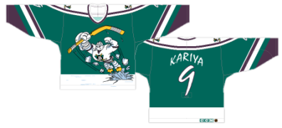
This is what happens when you’re owned by Disney.
The Mighty Ducks of Anaheim, at the time, were owned by Disney, who produced the beloved film franchise of the same name, which starred Emilio Estevez as a disgraced lawyer/inspirational youth hockey coach/minor league player. Coincidentally, Disney was releasing D3: The Mighty Ducks the same year as the team designed these eggplant and cyan duds. This may have been the closest anyone ever got to advertising on a jersey (although ads will likely adorn NHL jerseys in the near future.) It’s a cartoon! It’s cross-promotion! It’s corporate strategy!
The jersey, which features Wild Wing raising his arms (yes’ he’s got arms, beefy ones) in triumph, are totally, well, wild. They’re a complete departure from any other NHL jersey at the time. Being different doesn’t automatically make them good, thou
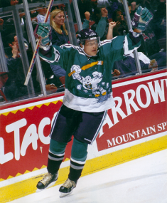
Life imitates art. Selanne and Wild Wing celly together.
gh. The names and numbers look like they were scrawled by a small child. The stripes on the arms look like a barber’s pole gone wrong.
And just look at Wild Wing himself! What’s wrong with his hockey stick? It’s not even the right shape. Why would he be busting through ice? Did he get stuck under there somehow? Did he not know winter was coming and somehow get frozen under it? Is he an idiot? Questions abound.
The Mighty Ducks wore the Wild Wing jerseys a grand total of six times before they were grounded for good.
#2: Vancouver Canucks “Flying V” jersey (1978-1985)

Hey! Who let that construction worker onto the ice?
I can only imagine how the conversation went when the Canucks designed this jersey.
“Ok, so our current blue, green and white jerseys are too boring. And the logo’s just a hockey stick. That’s kind of lame.”
“What should we do instead?”
“Well, we’re in Vancouver, so maybe a V design.”
“Where?”
“Everywhere.”
So they put it everywhere, right on the front, on the side of the pants, and even on the sleeves.
“Anything else?”
“They need to be seen. I’m sick of not being able to figure out who our players are on the ice.”
“You’re the boss.”
So they made them high-vis with garish and brash colours akin to a traffic cone: spicy Dijon yellow, construction vest orange, and black.
Allegedly, the “V” stood for “victory,” not “Vancouver.” Maybe they thought the V would help the Canucks win, as they had only had two winning seasons in franchise history at the time.
Like the “Wild Wing” jersey, the “Flying V” jersey was a total departure from any other jersey at the time, as it eschewed a logo for a simple geometric shape. It was oft ridiculed: Greg Douglas, a communications director for the Canucks, said he “wanted to slash (his) wrists” the first time he saw them, and they were often described as “puke yellow.”
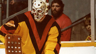
Nightmare fuel. Bromley’s mask, the jersey, the spectator’s beard. All of it.
If you get into a conversation with anyone about ugly jerseys, the “Flying V” will come up immediately. It’s true that it’s hard on the eyes. Really, it’s a total dumpster fire and completely unmarketable due to its lack of a logo (although, to be fair, fans of that era didn’t buy jerseys and team merch to the outrageous degree they do now.) Arguably, though, enough time has passed since the “Flying V” that some, including myself, consider them retroactively pretty cool and innovative.
1: St Louis Blues third jersey (designed 1996, never worn)
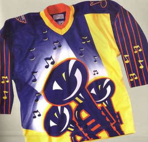
Duh-duh-duh-duh! Make way, mortals, for the zaniest jersey ever designed.
This is the one that never had its 60 under the bright lights.
Remember when I talked about Phoenix’s busy 90s jersey? This one blasts it away with roaring horns.
In 1996, the NHL came up with a new line of jerseys named “fashionable authentic.” That’s right, this jersey was once included in a line described as fashionable, which is a travesty.
Featuring three navy and dark orange trumpets blaring a random smattering of eighth and quarter notes, a urine coloured ‘Waluigi’ backward L terminating randomly near the collar’s right side, and horizontal striped arms resembling guitar strings, the St. Louis Blues were supposed to wear these against Tampa Bay in their first game after the All-Star Break in ‘96. However, they hit the ice in their regular uniforms and left the brass section backstage.
Although the NHL said that these designs were never finalized, rumour is that the coach of the Blues, “Iron” Mike Keenan, vetoed the “Burger King” jerseys, preventing them from being worn and his team becoming a laughing stock.

How I imagine Iron Mike Keenan reacted after seeing the uniforms. NHL legend has it that Keenan unilaterally vetoed the jerseys.
These jerseys are just horrific, which I why I love them. I’m not sure how much of that love is ironic. The trumpets and guitar strings make them totally regional, the colour scheme is repugnant, and the gradient tint white-to-blue background, off-centred trumpets, and patterns fly in the face of any design conventions.
I’m blue that these were never worn. They’re truly terrible, but I love that they exist and I find it hilarious that someone thought they were acceptable.
They’re so bad that the Blues refused to wear them, and that’s why they’re my favourite ugly jerseys of all time.
Don’t see the ugly jersey that clings to a piece of your heart represented in my list? I’m not perfect. Comment what your favourite ugly jersey is below.
Photos and sources:
Sundin St. Patricks: http://images.tsn.ca/images/stories/2016/3/17/st.patsgetty_72645.png
Roenick Coyotes:
https://www.nhl.com/coyotes/news/roenick-loves-coyotes-original-logo-jersey/c-756540
Mighty Ducks “Wild Wing” concept:
http://www.battleofcali.com/2013/11/5/5067818/worst-to-first-jerseys-the-anaheim-ducks
Selanne Mighty Ducks:
http://thirdstringgoalie.blogspot.ca/2010/08/1995-96-mighty-ducks-of-anaheim-paul.html
“Flying V” Jersey:
http://hockeybydesign.com/2015/07/worst-to-first-jerseys-the-vancouver-canucks-redux/
Gerry Cheevers “Flying V”:
https://www.nhl.com/canucks/news/6-things-canucks-jerseys/c-642378
St. Louis Blues unworn jersey:
Iron Mike:
http://www.hockeytube.net/2014/01/10/brett-hull-iron-mike-keenan/

Great article! One minor quibble, though: that’s Gary “Bones” Bromley in the skull mask and Canucks jersey. Gary Cheevers never played for the Canucks.
LikeLike
My mistake. I realize now that I mixed up Cheevers’ “scars” mask with Bromley’s “skull” mask. I’ll correct it immediately. Thanks for reading!
LikeLike